|
Let’s
spend a minute to understand what we put in here. What makes this
picture so stunning?
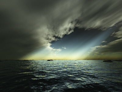
A
major factor in this scene is the altitude of the clouds. The
effect with high altitude clouds is, that you‘ll be able to see
a larger chunk of the sky. Thus, the sky tends to look more complex
and varietyful. If you set the clouds high, they also look smaller
( a no-brainer, I know) so you need to increase the maxium size
of the clouds to the 2nd largest position in order
to get the proportions right.
Now
for the 3D settings. As you have read, the clouds are not very
thick, the setting is at 8. Well, this raises the question, wether
you should enable 3D-clouds anyway, since they eat up a lot of
render time.
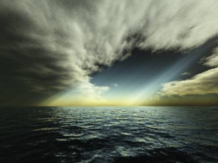
This
picture is the same as above, but this time rendered with 3D-clouds
unchecked.
As
you can see, the clouds look less detailed and … more flat. So,
if clouds play a central role in the composition of a scenery,
you may want to leave the 3D checkbox on. This is not generally
true, though. Some type of clouds cannot be done using the 3D
version. It's only, that 2D clouds don't look right when they're
supposed to be thick.
As
for the clouds color, I’d like to encourage you to play with these
settings yourself. Even if the only thing you’re after is realistic
clouds, you will find many cloud colors produced by nature herself!
May that be brown, yellow, red, gray, purple, golden etc…. There’s
virtually any color possible, and so it is in Terragen. Force
Majeur chose to have a gray color (with green increased a bit),
which support the stormy scenery well (This picture won the “Storm”
contest at Terracon).
The
darkening (55%) and contrast (40) are just as a thick, rainy cloud
should look like. If the same cloud wasn’t planned to be a dark
rain cloud, a contrast setting of 20 would keep the dramatic touch
while making the cloud look a little brighter.
Interesting
is the persistence setting at 50. Don’t go far beyond that with
low clouds, when 3D is set on, especially when using a small clouds
size. This won’t look good and will “pixelate” your clouds like
this (alt 64, thick 8, persistence 90):
In
some cases, you would find persistence at 50 unnatural, but for
high clouds, this interestingly gives more detail to the clouds,
which in turn looks good. Try to increase the persistence when
you have high clouds.
The
atmosphere dialog is less important for the clouds, except for
the decay. The decay filters the green and blue portion out of
the white light, so that only red light remains, the more intense
the decay takes effect (from your point of view, this is the case
the closer you look down to the horizon). At the end of the day
(also literally), red light colors white
clouds red, which you need to consider when composing a picture.
Now
let's look at the lighting conditions dialog. Of course, clouds
cast shadows in ‘Force Majeure’. Without this option, we would
barely have bright and dark areas in the picture, and therefore
the picture would be less epic. To compensate for the large amount
of shadows, and also to see some sunbeams in the haze, the sunlight
strength was set to 650%.
As
you can see, the “Effect of Atmosphere” parameter is left at its
default value (100%). In this scenery, a higher setting wouldn’t
have much effect, since we’re not looking towards the sun, plus
there’s no landscape in front of which the atmosphere could glow.
I’ve rendered this picture to show you the minor difference with
“Effect of Atmosphere” set to 200% (you can hardly see any) :
The
“Realistic sunlight penetration system” is checked, of course.
This is what you should always do when setting the params for
this dialog. I’m not gonna discuss this. But beside from making
your scene more relalistic, it also has an effect on the clouds,
since the more realistically colored atmosphere also impacts the
color of the clouds and haze. You need to check this box, period.
Now,
the background light tab is very important, as illustrated above,
for your scenary. For this specificl image, we see the “shadow
lightness” had been decreased significantly down to about 14.
Now look at the color we specified for “Light from above” in the
same tab, which is a dark green. We don’t see this color much
in the clouds, but if you take a closer look, you can see the
green. The low value for shadow lightness prevents this color
from coming out more intense. Although mandatory for a high contrast
scene, a low shadow lightness darkens any color, but the colors
will still be there. Look at this, I put the shadow lightness
value up a bit:
The
other color setting support the greenish touch (of the clouds),
by also having the green slider increased a bit (olive). But remember,
just because of the low value for shadow lightness, you don’t
see them instantaneously. Also, the colors are quite dark themselves.
The
last tab to discuss is the “Lightning of atmosphere” tab. Both
glow amount and glow power are cut down, to 56% and 14%. Why is
this? Well, it’s always good to have a look. Look at this:
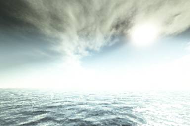
Do
you see any defined cloud structure in the upper right part of
the picture? There’s only a white glowing chunk, that’s it. I
increased both values (glow amount and power) up to the default
of 100%. The 650% of sunlight strenght overcast the clouds, so
in order to make it look realistic, you need to cut down the glow
values.
Now
we’re done with the discussion of this stunning picture. It really
deserves to be 1st place. Any component is composed
extremly well. I hope this illustrates in what a complex way the
various settings and parameters impact each other and vice versa.
BTW,
there’s one more hint for you to consider, if you were about to
try and create something similair: Make sure, your position is
WITHIN the shadow. If it’s not, your sight will be overcasted
by the glowing atmosphere and you will get mad, because there’s
no way of getting good contrasts this way. And cutting down the
sunlight strength won’t help much.
|